Designing With Glassmorphism
December 06, 2020
In this post, we're going to briefly go over what glassmorphism is, and learn how to replicate the effect in Figma.
Introduction
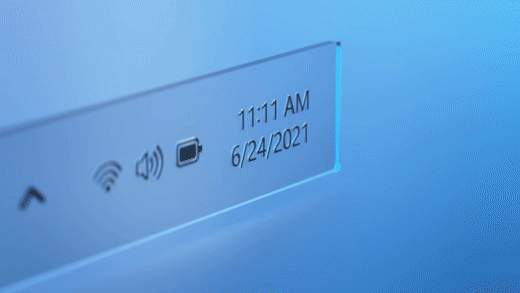
Glassmorphism: it's a fresh new design technique which we've seen used recently by many companies, and most notably, Microsoft in their Windows 11 video
The design trend for 2020 was neumorphism — which had some rather obvious issues relating to accessibility and contrast.
Developers started to use this with a lot of things, which was driving people a little bonkers.
Now, I'm not bashing neumorphism whatsoever. In fact, I myself like the idea of it somewhat. However, there are of course accessibility issues for people who have eyesight issues, causing the shadow-based contrast system to make the interface inaccessible for them to use.
Glassmorphism and Accessibility
Now, another important question which arises from these trendy new design styles is how accessible they are for people with disabilities.
The main appeal of Glassmorphism is how sleek and minimalistic it looks. We've already seen some examples of Glassmorphism in our daily lives, most notably in operating systems like MacOS Big Sur or the new Windows 11.
However, this doesn't make Glassmorphism an accessible style which the US Government should consider using for their unemployment insurance portal. Let's have a look at some of the accessibility problems that come with it:
Fonts
Oftentimes with Glassmorphism, developers struggle to make their fonts and text accessible from the website's background and the glass. Developers will often use larger fonts to get around this.
Borders and Contrast
Glassmorphism, in a way, revolves around borders to distinguish glass elements from non-glass ones. Many developers tend to use thin, light & rather transparent borders which take a toll on the accessibility. However, as can be seen in MacOS Big Sur, a sharper color contrast between the background of the app and the background of the glass element improve on this issue.
Designing With Glassmorphism
So, let's hop into Figma and create a new file.
Next, I'll search for some Mesh Gradients and pick one which I really like. I think I'll settle for this one:
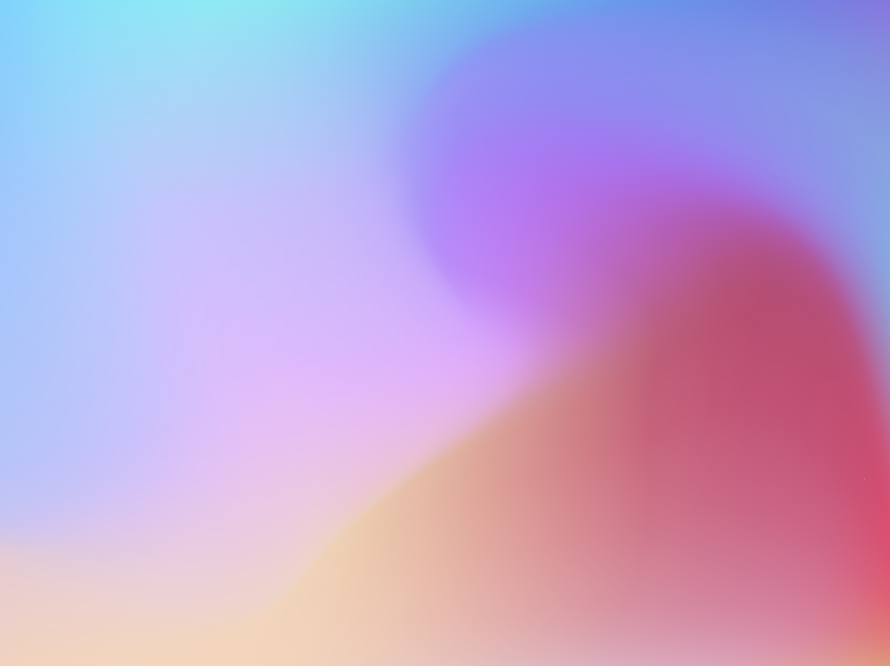
Let's just copy and paste this image file into Figma. I'll set the size to 1920x1080px.
Next, let's just create a simple rectangle. I'll dimensions to 900x500px and set the border radius to 30px.
Gradient Backgrounds
Now, let's go in the rectangle toggle a few things.
First, I'll get started by the color. Go over to the fill, and change it from solid to a linear gradient. I'll move the two points diagonally across the small box we just made.
Now, let's toggle the colors for these two. I'll go to the one up top and change the color white (#FFFFFF) and set opacity to 70%. For the bottom one, I'll set the color to white (#FFFFFF) and the opacity to 40%.
Here's a code for the linear gradient, if you want to use it:
background: linear-gradient(
  107.18deg,
  rgba(255, 255, 255, 0.7) 1.84%,
  rgba(255, 255, 255, 0.4) 100%
);
Borders
Next, let's give it a small outline. I'll go to outline, hit the '+' and create a new outline. I'll give this a thickness of 5px.
Let's go into colors again, and also make the color on this a gradient. I'll follow the same process as I did last time with the background color. I'll move the two points diagonally from the top left corner to the bottom right one.
I'll give the top one a color of white (#FFFFFF) with a opacity of 30% and give the top one a color of white (#FFFFFF) with an opacity of 20%.
Background Blur
Now, let's add some background blur. Do the same as said before. I'll set it to... maybe 15 for now.
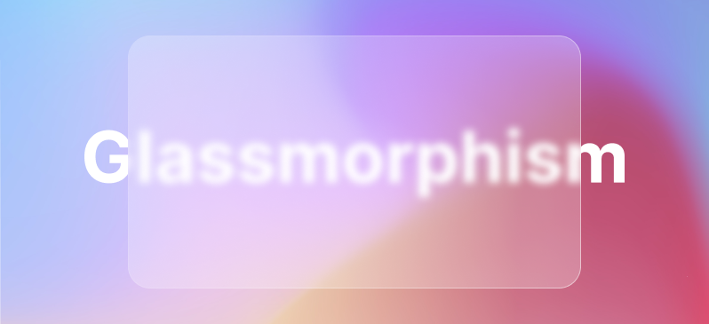
Then, to show this effect I'll just add some text. Let's choose a color of white (#FFFFFF), size of 144px a font of Poppins Bold.
Let's move it below the glass rectangle we created, and tada 🎉 — you can now see the effect.
Conclusion
In my opinnion, glassmorphism is a great new design trend which I can see emerging and taking the place of neumorphism in 2020. It has a lot of potential, as there aren't nearly as many accessibility issues with it as when compared to neumorphism.
Anyways, that's all for today. Until next time 👋